Last week we looked at Infographics we like and don’t like.
Today, we are going to pick one of two that we didn’t like and make them better!
Here are the two infographics and some background to them to help guide you. You are welcome to do more research, but try to keep the purpose of the infographic the same on your improved version.
First of all, before you start to re-design, think about the message of the infographic. What ‘story’ do you want to tell, or what information are you trying to simplify or clarify?
Next, look back at the comments that your fellow students made about infographics they did like. What is it that makes an infographic interesting, compelling to read, and a good delivery of information? Think about your design, and not just the information you are sharing!
Here are the infographics, and some links to learn more. Click on the inographics to see the original versions.
To learn more: ~You have to pay for the actual study, so no link for that:(
Images: Try searching Google for silhouette clip art or add the word people or clock or candle (these are just examples, but does this infographic even need a clock?).
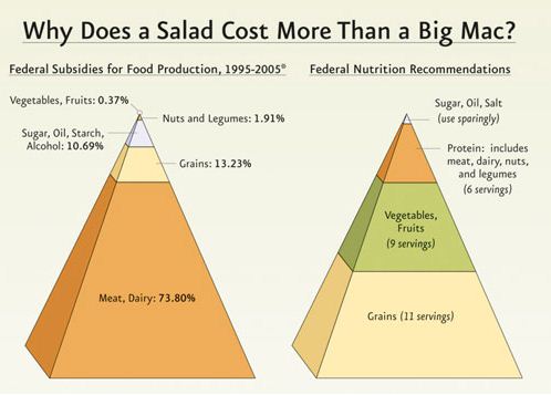
Original Source: http://www.uwec.edu/geography/ivogeler/w111/articles/Food-Pyramid-Federal-Subsidies.png
Federal Food Subsidies (In the US, which is what the infographic is about) – Notice the most subsidized item is corn/feed. This is used to feed the animals that we eat, so even though it is a vegetable that is subsidized, this is done to keep the cost of meat lower.
Images that are basic shapes like these can easily be duplicated on Powerpoint… but does this information need to be represented this way or are there more interesting ways to show this? What is confusing about this infographic? How can you change that? Also, notice the disconnect between what the two images are telling you and what the title of the infographic is. This infographic wants to tell you a good story… it just isn’t doing it well!
Work in teams of two or three and make one of these better! Share a copy of this version and your own improved version on at least one (or all) of your blogs. Be sure to include the names of everyone that worked on your new and improved infographic and share a link in the comments below. (Or share the link to this post on your post and the link-back will happen automatically.)
And of course, if you would rather choose a different infographic to improve, go right ahead… just don’t waste time looking for one when you’ve got two perfectly awful examples to improve above! 🙂


The info graph made by Wilson, Liam and Owen
http://owenw.inquiryhub.org/2013/02/13/221/
Here is a link to my blog post containing my new and improved infographic:
http://sck.inquiryhub.org/2013/02/14/new-and-improved-infographic/
Here is my revised infograph
http://annicah.inquiryhub.org/2013/02/13/february-13th-infograph/
Sophia, Shauna, and Hannah:
http://sophiad.inquiryhub.org/2013/02/08/infographic/
I redid my infograph according to the critiques of my mum, brother and SCK. Here it is
http://annicah.inquiryhub.org/2013/02/21/february-20thinfograph/
Our improved infographic by Aaron, Jay, and Leif
http://jayj.inquiryhub.org/files/2013/03/New-and-improved-infograph-19pelv3.png
Here is a link to our new and improved infograph.
http://owenw.inquiryhub.org/2013/03/02/infographic-2-0/
Our infographic by Jay, Aaron, and Leif
http://jayj.inquiryhub.org/files/2013/03/Slide1-1nvzm7f.jpg
Here is our new infographic (Sophia, Shauna, and Hannah)
http://sophiad.inquiryhub.org/2013/03/08/revised-infographic/
http://nicov.inquiryhub.org/2013/03/08/infographic/
Elijah, Max, Nico
Here is our new revised version of our info graphic
http://sophiad.inquiryhub.org/2013/03/08/revised-infographic/
Our new and improved infographic
http://jayj.inquiryhub.org/files/2013/03/Slide1-1nw2yv8.jpg
Kayla, Meghan, Gabe…
http://meghanp.inquiryhub.org/2013/03/08/infograph/
http://pabloe.inquiryhub.org/files/2013/03/infographic-1phsip5.jpg our infograph
Sheila, Gabriel, Pablo
Here’s my second attempt at a passable infographic.
http://nicov.inquiryhub.org/2013/03/08/infographic-part-deux/
Nico, Max, Elijah